Light & Color
Light, an electromagnetic radiation
According to physics, light is an electromagnetic radiation within a certain portion of the electromagnetic spectrum. By light, we usually mean ‘visible light’, which is the part of the electromagnetic spectum visible by the human eye (400-700 nm).
Electromagnetic radiations are characterised by their spatial period, which is called wavelength. This is the distance over which the wave’s shape repeats. The wavelength defines the color of the light.
There are 2 different type of lights:
- Polychromatic light: this is a light which is composed of several colors, i.e. radiations of more than one wavelength. The color is a combination of the colors associated to each wavelength. As an example, the light emitted by the sun is polychromatic.
- Monochromatic light: this is the light of a single wavelength. Those lights are constitued by only one color.
Color vision
Thus, we are capable to perceive and to see a physical phenomenom and to distinguish a physical property: the wavelength. But how?
In the human eyes, there are 2 different types of cells responsible for light and color vision:
- Rod cells: They are photoreceptor cells and they are responsible for vision of light intensity. They do not hold a big role in color vision, but they are very sensible to light. That explains why color vision is less important by night.
- Cone cells: These cells are responsible for color vision. They are 100 times less sensible than rod cells to light intensity, but they are able to capture different type of colors. They are 3 different types of cone cells: S, M and L types respectively responsible for vision of Blue, Green and Red.
After being mesured by eye cells, the information is transmitted by neurotransmitter to the visual cortex, which will process visual information.
NB: Thus, the way the eye captures colors is the same as the RGB color model (used in computers). This model model allows to reconstitute every single color by adding the 3 primary colors.
Color vision deficiency
How?
As told before, cells responsibles for color vision are the cone cells. But how does it work when those cells are not fully functional or absent? That’s precisely what happens when a person is suffering from color vision deficiency.
- Achromatopsia: This is the inability to perceive any color, i.e. total color blindness. These people are only able to black, white and shades of grey.
- Deutera/Prota/Trita-nomaly: This is a mutation making these people less sensible to Green/Red/Blue colors.
- Deutera/Prota/Trita-nopia: The cone responsible for Green/Red/Blue color vision is missing.
Are you Color Blind?
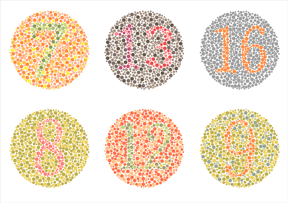
Lots of free tests can be done online. Most of the time, you have to read numbers inside circles made up of different colors. For example, in the previous image, I (as a Red/Green color blind) can only read correctly the number ‘16’, and barrely enough the numbers ‘7’ and ‘8’. The others are completly unreadable. If you are not able to read all the numbers in the images (from left to right, top to bottom : 7 - 13 - 16 // 8 - 12 - 9), you should probably take a more thorough test to make sure you do not suffer from any form of color blindness.
Even if you are able to read every number, that does not mean you are free from any form of color blindness, as there are a lot of different forms. Real color blindness tests are longer with more images and they are testing for all forms of color blindness.
Prevalence
In the next paragraph, males and females always define people with respectively XY and XX chromosomes (i.e. biological males and females). For simplification, we won’t talk about sex chromosome aneuploidies (individues with an abnormal number of sex chromosomes)
Color vision deficiency affects more of less 4.5% of the population. It can be less or more depending on the region and the biological sex (XY or XX chromosomes). Actually, males have more chances to be color blind, as the mutations of defaults responsible for color vision deficiency are present on the X chromosome. As females have got 2 X chromosomes, when a mutation is present on one chromosome, if the other X chromosome is viable, they will not be color blind. The viable chromosome will properly code for the cone cells. Males only have one X chromosome, meaning if it is faulty, there is no other X chromosome. That is will color blindness affect many more males rather than females.
| Males – XY | Females – XX | |
|---|---|---|
| Achromatopsia | 0.00001% | 0.00001% |
| Deuteranomaly | 5.0% | 0.35% |
| Protanomaly | 1.3% | 0.02% |
| Tritanomaly | 0.0001% | 0.0001% |
| Deuteranopia | 1.2% | 0.01% |
| Protanopia | 1.3% | 0.02% |
| Tritanopia | 0.001% | 0.03% |
| Total | 8.9% | 0.43% |
The majority of people suffering from color blindness are Green-Red color blinds. Meaning they are either less sensible to green (deuteranomaly) or almost completely unable to distinguish green color (deuteranopia).
Thus, we can say that color blindness, with 4-5% overall prevalence (up to 10% for men in certain regions), is a quite frequent deficiency that must not be neglected.
Colors are meaningful
In our modern society, colors are important. They, by themselves, hold a semantic value. For example, Red is often associated with danger, anger, important whereas Green, is associated with peace, protection, correct. Thus, in our daily life, everything dangerous is often symbolized with red or orange color (caution symbols, errors, etc) whearas when something is correct, when everything is right, we tend to use the green color.
For example, when searching for ‘delete’ or ‘okay’ buttons on google, you will see the following results:

Moreover, in the web ecosystem (front-end frameworks), we often have 4 different type of badges with default associated colors (see the image bellow, from Bootstrap framework):
info: bluesucess: greenwarning: orangedanger: red

If these colors seems well associated by the context (danger, success, etc), it is because they are by themselves meaningful. We use to associated a profound meaning to these color, and this meaning is sometimes not accessible or not understandable for people suffering from color blindness. That’s why we need to help them.
Colors are important
In real life, colors are important for lots of different things, such as:
- Visualising danger zones (Orange, Red)
- Traffic lights (Red, Orange, Green)
- Video games (Green for allies, Red for enemies)
- Resistors (electrical component)
Colors are so important that some jobs may be forbidden to color blind people (depending on the nature of color blindness), such as pilot or air traffic controller. But color blinds can have difficulties in other professions related to colors such as medical doctor, electrician and every profession where colors are important.
For color blinds, information led by colors is very hard to process and to understand.
A review of colors and accessibility in some interfaces
We will review some interfaces and try to rate their accessibility for color blinds. Left images will be normal vision and right images will be vision with deuteranopia
Trello login screen

When comparing these 2 images, we can note the following issues with this interface:
- Colors are hardly distinguishable by Green-Red color blind people.
- The error message is not contextualized. It is located before the ‘Log in to Trello’ title, and before reading it, we do not know where is the problem.
- No icon is present explaing there is some errors.
- For normal vision (left), the easiest way to say there is an error is the red color. But it is clear that on the color blind vision (right), the contrast is not as important, and the interface is less readable.
It is very clear that in this case, color blinds have more difficulties to read and understand the interface rather than non-color blind people.
Facebook login screen

Here, we can see that:
- Red / Green contrast are quite good, even if with Green-Read color blindness (right). The colors have been chosen correctly for accessibility.
- Contextualized error (the hover ‘What’s your name?’). Very helpful to know where the error come from.
- Red color AND error icons on the fields where the information is missing. If the color is not correctly seen, we can rely on icons to understand the information.
In conclusion, this is an accessible interface for color blind people. And this is maybe because Mark Zuckerberg himself is Red/Green color blind. That’s also why he choose the blue color for Facebook, because “blue is the richest color for [him]”.
Trello dashboard color blind mode
After reviewing the login screen of Trello, we will speak about their color blind mode for dashboard. On each dashboard, we can enable color blind mode, which will add textures to colors, to make them easily distinguishable even with color vision deficiency.
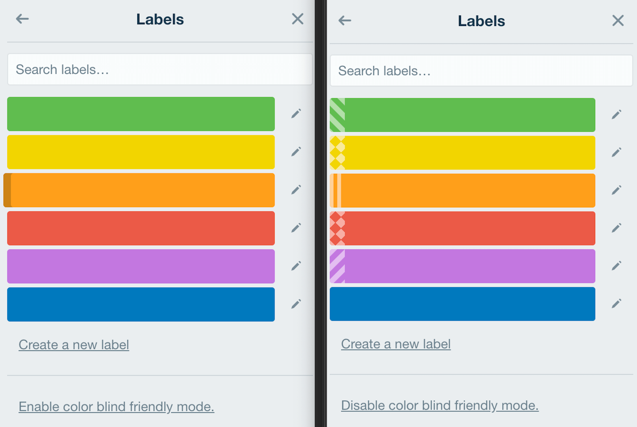
When color blind mode is enabled, textures are added to color labels, meaning even with total color blindness, these textures will help people to differentiate the labels.
This mode is very well designed and works very well to help people understanding the difference between colors.
Accessibility strategies for color blindess
We have seen some real interfaces showing that designing an accessible interface for color blinds is not easy and trivial. In order to be accessible, an interface should follow some rules and be designed expressively with accessibility in mind.
Icons
Each time an information is present with color (success, danger, warning, etc), it must also be expressed differently. Icons can help color blinds to understand and interpretate information more easily. For example:
- ✅ for success
- ❗️ for danger
- ❌ for failure or error

In the GitHub login screen you can see above, the displayed icons are a perfect illustration of a well-designed interface for color blind people.
Textures
Textures are also a good way to enrich color information. When you are not sure colors will be not correctly interpretated by color blind people, adding patterns, textures are a good way to add another way to differentiate elements in addition to color meanings.
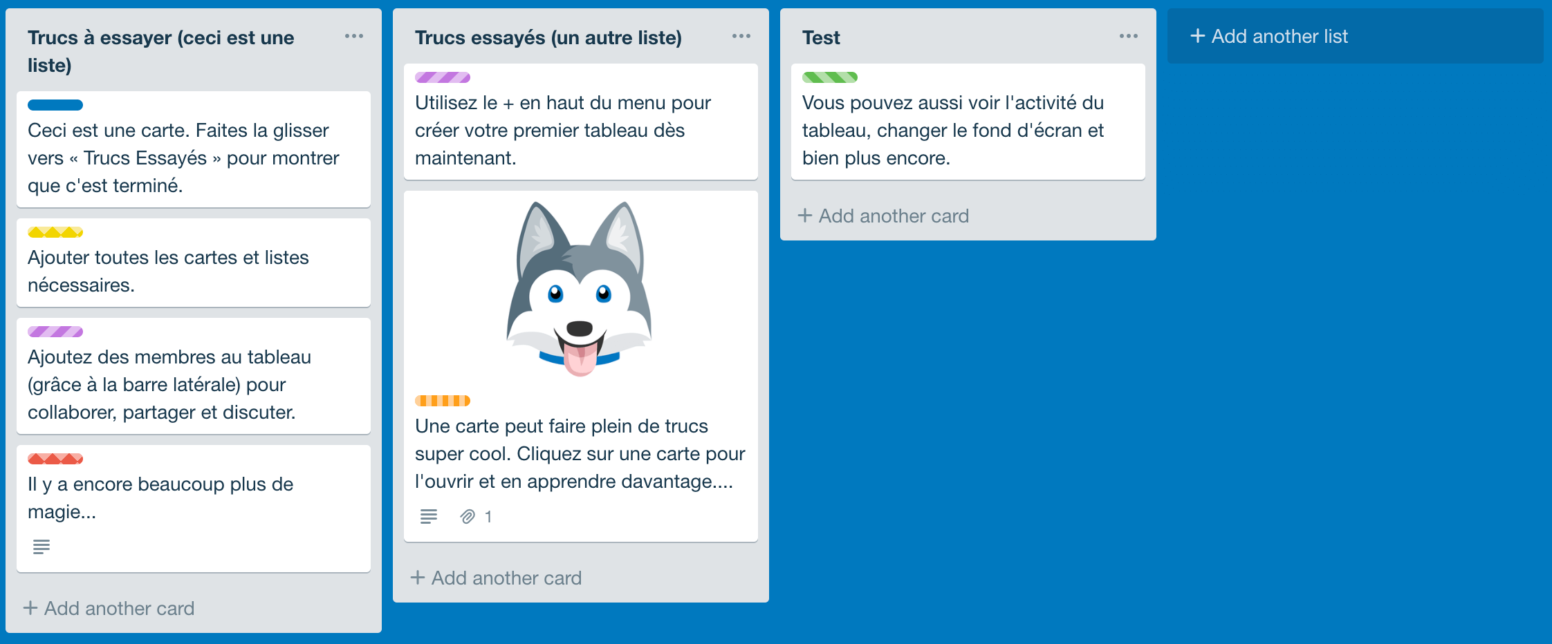
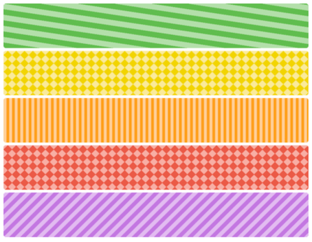
Trello color blind mode we have seen before is a perfect example of that. When enabling this mode in a Trello dashboard, all colored labels will be completed by a pattern, making it very easy to identify. See the image bellow.
Colors that must not be used together
Green should never be used with Red
This is the easiest way to solve the problem. As most of color blind people have difficulties differentiating couple of colors, it is a good practice to completely avoid using those couples.
For example, as most of color blind people are Red/Green color blind, the association of Green and Red colors should be banned and replaced by more contrasted colors. Most of the time these colors are associated in a Failure-Sucess context, where the couple Red/Blue could also be used.
But you should not just focus on Red/Green association, because other forms of color blindess can be challenged by other color associations. The following colors should not be associated to convey important information, because they could be hardly distinguishable by color blind people in general:
- Red/Green
- Green/Brown
- Blue/Purple
- Green/Blue
- Clear Green/Yellow
- Blue/Gray
- Green/Gray
- Green/Black
Minimal themes
No colors? No problems!

More there are colors or shades of colors in an application, more it is likely that the interface will be less readable for color blind people. Minimal and simple interfaces, with as little colors as possible, are very easy to read and to understand, even with color vision deficiency.
A proposition of improvement
We have seen before that Trello login screen is not very accessible for color blind people. I have tried to improve it, just by changing colors and using colors from the Trello color scheme:
- Log In button color has been changed from
#5aac44to#026aa7, which is the header bar color of Trello. - ‘Invalid Password’ label color has been changed from
#eb5a46to#b04632, which is the red label color in Trello dashboards. - Input element border in error has been changed from
#ec9488to#b04632.

Above, you can see Trello login interface before (left) and after (right) the changes. Bellow, there is the same image, but with a red/green color blind filter applied.

That’s how I have improved Trello’s login page in 2 minutes, using their own theme colors. Colors accessibility is easy, but it needs to be thought every time a new interface is designed.
Resources for designing accessible interfaces
Designing accessibles interfaces for color blind people can be done more easily with the following tools:
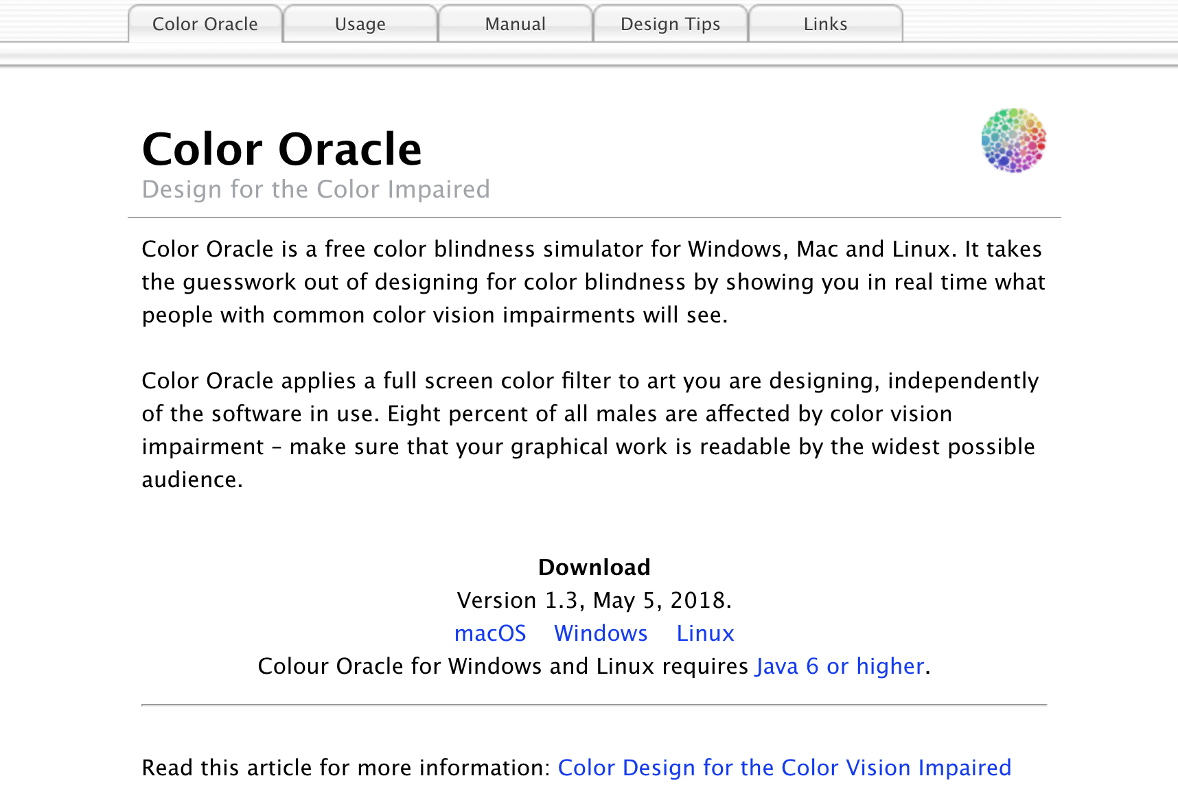
- Color Oracle: Color Oracle allows to simulate the vision of 4 different types of color blindness: deuteranopia, tritanopia, protanopia and achromatopsia. It will apply a filter on the screen, changing the colors and simulating a color vision deficiency.
- [Wearecolor blind.com](https://wearecolor blind.com/): This website contains a lot of resources for color blind people, and it also contains [examples](https://wearecolor blind.com/examples/) of well or bad designed interfaces. It can provide ideas and example of what should be done for accessibility.
Conclusion
Don’t rely on color alone – W3C
We have seen that color blindness is not a rare vision deficiency, as it can affect up to 10% of males in some regions of the world. This means that more or less 5% of the people that will use your application will have a color deficiency.
Sometimes, when working in web development, we hear that the website or the application must absolutely be compatible with IE 11. IE 11 market share is currently 3.43%. This means that the proportion of color blind using the application (more or less 5%) is probably higher than the proportion of people using the application with IE 11. Thus, making the application accessible for color blinds is more important than making it compatible with IE 11. And if we work to make something working on IE 11, why wouldn’t we work to make it accessible for color blind people, as they are probably more frequent than IE user?
We have seen that colors should not be the only vector of information in interfaces. The following strategies can be used to make an interface accessible and color blind-friendly:
- Icons and pictograms
- Textures and patterns, to enrich color
- Avoid using colors together when they can be confusing for color blind people
- Designing a minimal interface with few colors
Finally, when creating an interface, some tools can be used to simulate color blind vision, to be sure an interface is accessible, such as Color Oracle.
Sources
This article has been inspired by all the difficulties I have encountered while using website and interfaces.
These websites have been used for some informations, images and illustrations.