Introduction
In the past few years, almost every software and blog started to add the possibility to switch between a light and a dark mode. I am myself a huge enthusiast of it and turned on dark mode on almost all the apps and websites I use regularly. However, until now, my personal blog did not had this feature yet. What a shame. This article relates my journey of adding this feature.
Theming hugo
The principle of theming hugo is adding your desired theme git repository as a submodule under ./blog/themes/ and then, to declare the theme name in ./blog/config.toml:
I am currently using Hikari theme, by digitalcraftsman. As far as I know, this theme does not include the possibility to switch between themes yet and it’s also archived and not maintained anymore. So after forking it, I decided to update it for my own usage.
Theming CSS
Althought I don’t have a lot of experience regarding theming web applications in CSS, I think the most easy way is to add a specific class to the <body> HTML tag depending on the theme we want to apply to the page. For example <body class="dark"></body> for a dark theme or <body class="light"></body> for a light theme.
Then, we have to write specific CSS targeting all elements we want to style under the .dark (or .light or .${THEME}) class. For example, .dark header h1 { color: #fff }.
Switching between themes
Considering what we said in the previous paragraph, we want to add buttons to dynamically add and remove classes on the <body> HTML tag.
Icons for light and dark theme buttons
Material Icons are beautiful and ready to be used! Sun and moon icons will be perfect for choosing between light and dark theme.

Changing class on <body> tag dynamically
Principles
This behavior relies on the following steps:
- Adding 2 buttons, one for the light theme and one for the dark theme
- Choosing a default theme, which means hiding a button by default (hiding the light theme button if the default theme is light, or hiding the dark theme button if the default theme is dark)
- Setting up click handlers on the buttons, so that onclick, we hide the button, display the opposite button, and change the class on
<body>Accordingly. For example, if we click on the dark theme button, we have to hide the dark theme button, display the light theme button and add thedarkclass to<body>
At first, I have implemented this feature in the main javascript file of the hugo theme, loaded in the callback window.onload. However, I met some latency issues (where the light theme was displayed during a second and then the black theme were applied. This was not really satisfying because the interface was blinking) and I decided to inline the javascript file of this theming behavior directly after the html template.
Implementation
html
javascript
Saving selected theme
Principles
To store the user configuration, we can use the browser LocalStorage API, which allows us to store key-value properties. So we can store the theme information (light|dark) under the theme key. The API is very easy to use:
javascript
We have to add the LocalStorage calls inside the previous javascript snippet, i.e.:
- Save the
darkvalue inLocalStorageinsideapplyDarkThemefunction - Save the
lightvalue inLocalStorageinside theapplyLightThemefunction - Read
LocalStorageon page load and apply the theme accordingly.
Implementation
javascript
Dark theme colors
I like dark themes with blue, purple and yellow contrasts. So I have choosen this colors for my theme. Many thanks to Coolors which has been helping me picking up colors for years 😅.
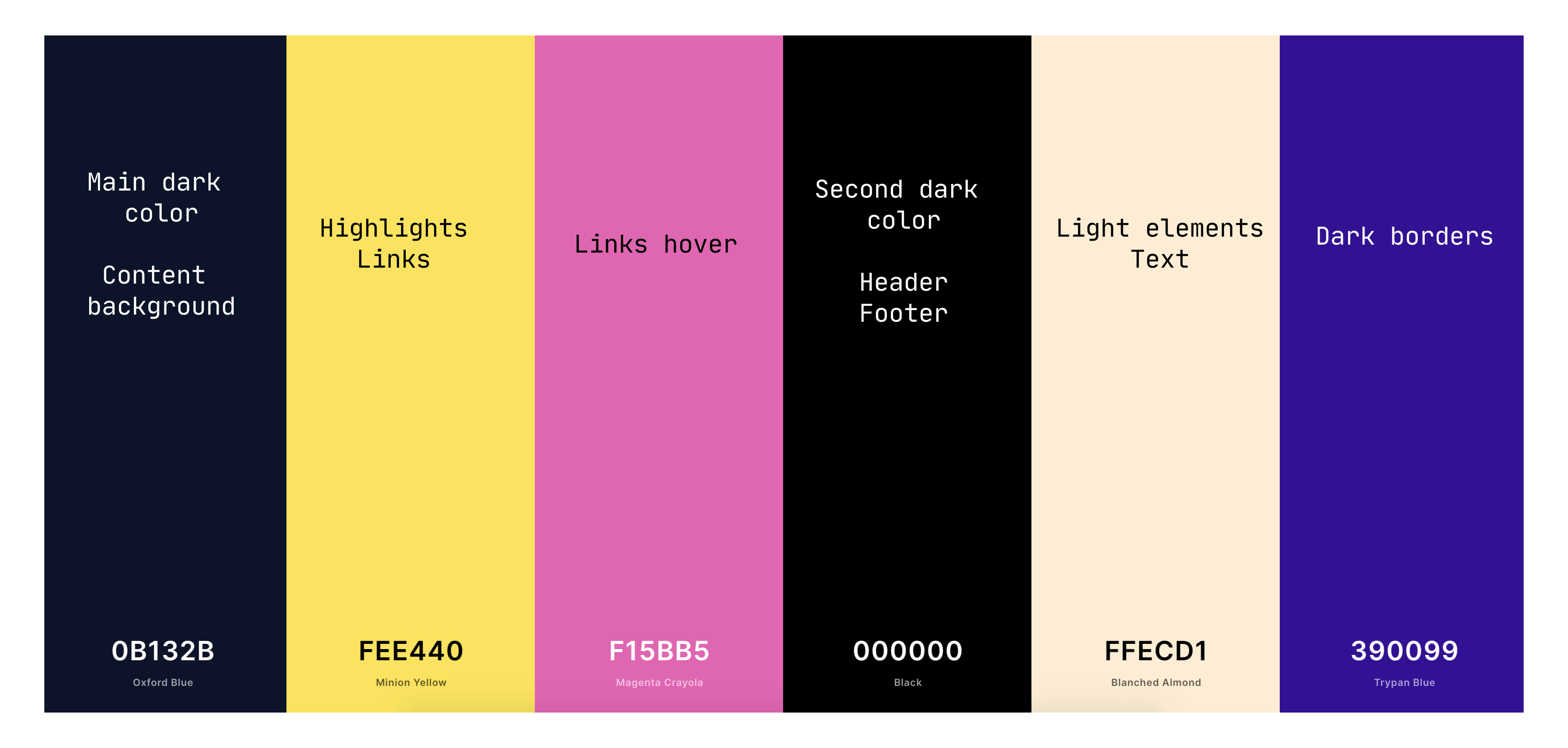
Of course we have to use this colors in a dedicated .css file, to style elements correctly depending on the theme. Below, a short snippet of my dark.css:
css
Conclusion
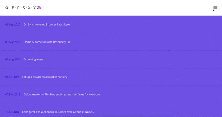
Today we have added a dark theme to our hugo blog! Below, a little demonstration
If you are interested in Minhikari, my fork of hikari, you can find it here.